
Study Notes
Download pdf 1 MB
More Free Lessons in
Get cutting-edge digital marketing skills, know-how and strategy
This micro lesson is from one of our globally recognized digital marketing courses.
Start a FREE Course Preview12 years delivering excellence
Join a global community
Globally recognised
Toolkits, content & more
In this example, we have a low fidelity wireframe. As you can see, this is a very simple layout showing the main content blocks on the page, where the visual emphasis should be, for instance any calls to action that need to be highlighted for the user.
Using something as simple as this, we can adequately communicate a basic layout, a visual hierarchy, and relative priorities on the page. We can also indicate different media types, such as video, text content and images, as shown here. These can begin to prompt early feedback or gain broad agreement on the direction the design needs to take before too much time is invested in rendering the page in any great detail.
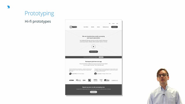
This is the same page rendered in higher fidelity.
In this version, we’ve started the process of filling in the design with greater detail, including the style and amount of copy appearing at various points on the page. Again, while images have begun to be represented and some modest styling has been added, discussion and feedback should continue to be focused on the fundamental elements of the page, rather than becoming fixated on brand or visual design.
That’s the real strength of wireframes, and UX design in general:
Rick Monro is UX Director at Fathom. He has extensive experience in user research, interaction design, user-centered design, and design strategy with private and public sector organisations throughout the UK and Ireland.

Data protection regulations affect almost all aspects of digital marketing. Therefore, DMI has produced a short course on GDPR for all of our students. If you wish to learn more about GDPR, you can do so here:
If you are interested in learning about the principles of UX and the tools or techniques that you can use to develop and refine your user's experience, DMI has produced a short course on the subject for all of our students. You can access this content here:
DMI Short Course: UX Essentials
The following pieces of content from the Digital Marketing Institute's Membership Library have been chosen to offer additional material that you might find interesting or insightful.
You can find more information and content like this on the Digital Marketing Institute's Membership Library
You will not be assessed on this content in your final exam.
ABOUT THIS DIGITAL MARKETING MODULE
 Rick Monro
The UX Design module will cover in depth the differences between interactive and presentational communication, illustrating how the priority of the marketer shifts from getting attention in a presentational environment, to giving attention in an interactive environment. You will understand how a user-focused approach to design impacts content planning, information architecture, customer-journey planning, prototyping, testing and validation, progressive-disclosure and other powerful approaches to the display and interactivity of content.
Ready to learn more about Web Design, CRO and UX?
Sign up for a FREE trial, and get access to more great content to help you level up your digital marketing career.